Winter Colour Trends 2025 for Homes, Décor & Blinds
If winter makes you think of grey skies and hibernation-mode interiors, 2025 is your permission slip to add warmth, depth and a little quiet luxury back into your rooms.
This year’s palettes lean into buttery warm neutrals, forest-leaning greens and deep, enveloping blues – tones that flatter low winter light and make a home feel more like a sanctuary.
Think cocooning lounges, calming bedrooms and kitchens that glow softly at breakfast rather than glare. The mood is easy to live with and quietly confident, and the effect on how you feel through the darker months is surprisingly powerful.
Why Colour Matters More in Winter
Light changes everything, especially in winter when days are shorter and the daylight is cooler. Colours that look crisp in August can feel chilly by December, while warmer mid-tones diffuse the light and take the edge off.
Your eye reads these subtle cues instantly: warm hues feel sociable and comforting; greens connect you to nature and suggest restoration; deep blues encourage focus and calm. When you choose colours with the season in mind, rooms feel more welcoming by day and wonderfully snug by night.
That emotional lift – walking into a space that visibly softens the gloom outside – makes an enormous difference to winter wellbeing.
2025 in a Nutshell
The direction of travel this year is towards colour that cares for you.
Rather than stark contrasts, schemes are layered and tactile, with a preference for hues that are rich without shouting. Warm neutrals replace cool greys, greens drift into mossy and olive territory, and blues become inky and confident.
Accents still have a place, but they are used like punctuation rather than headlines. The overall impression is polished yet homely, as if your space has taken a deep breath and decided to prioritise comfort with style.
Warm Neutrals: The Cosy Foundation
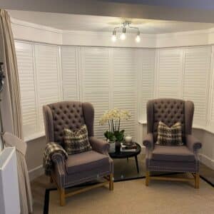
Warm neutrals are the backbone of many great winter schemes in 2025. Shades like oat, mushroom, putty and honeyed beige create a soft-focus backdrop that flatters furniture and skin tones alike.
On walls, these colours seem to hold the light rather than bounce it harshly, which makes a room feel more intimate without becoming dark. In living rooms, a mushroom-taupe wall behind a linen sofa instantly adds composure; in bedrooms, a putty tone around the headboard frame makes the space feel hotel-calm.
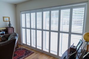
When it comes to window dressings, warm-neutral blinds are a quiet revelation. Roman or roller blinds in textured neutral fabrics read more like soft furnishings than purely functional kit. They filter the thin winter daylight into something mellow and gentle, and when you add a thermal lining you feel the warmth in a very real sense.
Even the smallest hallway gains presence with a warm-toned blind pulled just-so at dusk, the fabric catching lamplight and adding a subtle glow.
Forest and Olive Greens: Restorative Depth
Green continues to thrive this year, but the nuance is in the undertone. Forest, olive and moss bring a depth that feels elegant and grounded, especially in winter. These shades bridge the gap between outside and in, echoing woodland walks and aged timber.
In a kitchen, olive cabinetry paired with warm metal hardware feels classic yet current. In a snug or home library, a richer forest green along the walls frames books and art beautifully and turns the room into a retreat.
Blinds are a smart way to introduce green without committing every surface. A forest-green Roman blind against warm-neutral walls adds dimension and a hint of drama. Faux-wood venetians with a gentle olive cast provide a traditional look with modern control of light.
The psychological nudge is notable too: green is strongly associated with calm and restoration, a tonic when the world outside looks bleak. Even a single green element – say, a deep-toned blind paired with a timber side table – can settle the mood of a whole space.
Deep Blues: Tailored and Tranquil
Deep blues – ink, midnight and petrol – are the sophisticated counterpoint to winter’s pale sky. These shades are brilliant at sharpening a scheme while keeping it cosy, particularly when you combine them with warm textures.
In a living room, midnight walls draw art, mirrors and brass details into focus; in a bedroom, a deep-blue feature behind the bed makes the room feel cocooned and grown-up. For a home office, navy offers a steadying presence that helps you concentrate as the daylight dips.
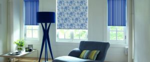
Blue also shines at the window. An inky Roman blind in a tactile weave looks tailored and plush, like a favourite velvet blazer. In a pale room, that single move introduces depth and contrast without overwhelming the space.
To maintain warmth, finish the look with caramel woods, tan leather or cinnamon-toned textiles. The balance between cool and warm feels intentional and incredibly inviting, particularly under lamplight on winter evenings.
Using Colour with Blinds for Maximum Winter Comfort
Blinds are often underrated as design tools when, in winter, they may be the most influential element in the room.
Fabric choice, lining and operation style all shape your experience of light and warmth. Thicker weaves and thermal linings help trap heat, while Duette (cellular) constructions create insulating pockets of air to reduce heat loss at the glass.
Choose a colour that supports the mood: a warm neutral for serenity, a green for restorative calm, or a deep blue for intimacy and focus.
Control is equally important. Winter sun sits lower in the sky and can be dazzling precisely when you want to read, work or watch a film. Top-down/bottom-up blinds are superb here because you can lower coverage from the top to cut glare while keeping the lower pane open for privacy and daylight.
The effect is simple but transformative, turning a bright, chilly angle of sunlight into a gentle wash across the room. When you pair this function with a rich, tactile fabric, you get performance and polish in one move.

Three Fool-Proof Ways to Pull a Scheme Together
If you like a clear starting point, begin by deciding how you want the room to feel at 6pm.
For calm, choose warm-neutral walls, then add a mushroom-toned Roman blind with a soft, linen-like texture. Bring in a hint of gentle sunshine through a small lamp shade or throw with honey undertones and let brushed brass details pick up the glow. The result is quietly luxurious and very liveable.
For a restorative, nature-led ambience, lean into olive walls and deepen the tone at the window with a forest-green blind. Mid-brown timber furniture, boucle cushions and a few well-placed plants complete the picture.
By day, the room appears fresh and grounded; by night, it feels like a private retreat. The green-on-green relationship is especially flattering in winter light, which often pulls out the warmth in these shades.
For something more tailored and intimate, keep the walls in soft putty and make the window your anchor with an inky-blue blind. Add a cognac leather chair and a vintage-style brass floor lamp to bring warmth back into the palette. A cinnamon-coloured cushion or throw will stitch the elements together.
This approach is ideal for living rooms, bedrooms and studies where you want the mood to drop a few decibels after dusk without tipping into gloom.
Accents and Finishes That Carry the Look
Once your foundation colour is in place, consider the finishing touches that amplify the winter mood. Textures do much of the heavy lifting: wool throws, boucle upholstery and natural timber make even a pale scheme feel warm.
Metals should skew warm rather than cold; brass and bronze pair beautifully with mushrooms, olives and deep blues. If you paint trims or panelling, try stepping a shade deeper than the wall instead of defaulting to white. This subtle move creates a custom look and emphasises the cocooning quality of winter palettes.
Artwork and smaller textiles are where a little joy can peep through. A gentle yellow print above a console or a soft sky-blue vase on a bookshelf can lift a deeper scheme without breaking the spell.
The rule of thumb is simple: one foundational hue for calm, one deep anchor for focus, and one cheerful accent for lift. When you apply that rhythm to cushions, lampshades and table linens, rooms feel layered rather than busy.
If You’re Renting or Working with a Small Space
Not everyone can repaint, but you can still bring 2025’s warmth home. Changing blinds is one of the quickest upgrades, and the difference in both look and thermal comfort can be immediate.
A deep-toned Roman or a cellular blind with a thermal lining adds presence and traps heat. Lighting also matters; warm-temperature bulbs and multiple small lamps create a soft, flattering ambience that suits these palettes.
Removable elements – art, cushions, throws and table runners – carry plenty of colour without committing you long-term, which is ideal if you like to refresh your look seasonally.
Final Thoughts: Choose Comfort First, Trend Second
The loveliest thing about 2025’s winter colours is how kind they are to live with. Warm neutrals, forest greens and deep blues are timeless enough to last beyond the season, yet modern enough to feel fresh.
Start from the feeling you want – calm, restored or cocooned – and let that guide your palette. Use blinds to fine-tune light, add real insulation and introduce sophisticated texture, and consider a top-down/bottom-up option to tame winter’s low sun without losing precious daylight.
When colour, fabric and function work together, the result is a home that looks beautiful, lifts your mood and makes winter feel like an invitation rather than an endurance test.
At Fraser James Blinds, we have plenty of products and ranges that will suit every need. Should you require any more information about any of those products, please contact us. Our friendly, yet professional team is always more than happy to help. Alternatively, you can also arrange a home visit at a time that works best for you.